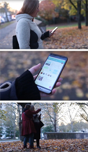
The App
This scavenger hunt app allows the user to explore their home surroundings and holiday destinations in a new way, as well as letting them create their own, unique hunts. They can enjoy this game on their own or invite friends and strangers to accompany them.
Project Summary
The goal was to create a scavenger hunt app and explore the full range of available UX methods while doing so. This was part of the Careerfoundry intensive course on UX design that I completed between May and October 2019.
My Role
I started out as a researcher, did all the planning, the information architecture, wireframing, prototyping as well as the usertesting and finally the UI design. Below you can get a glimpse into the whole process and what this journey taught me.
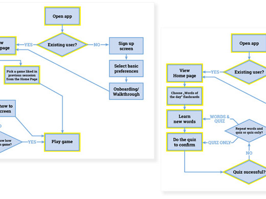
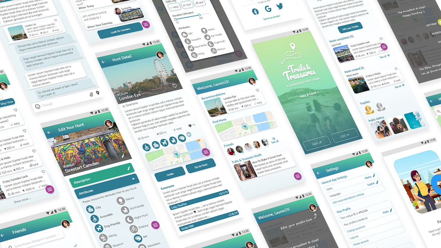
The Prototype
On the right is a clickable prototype of the (for now) final design. Feel free to click through and explore it!


It's Like Going on an Adventure
It all starts with figuring out the market and what problems there could be. I did a throughout competitor analysis, checked out similar apps and games and looked at a few of the competitors in depth. I needed to figure out which app did well - and why. What made them successful? What can I learn from them and take over for my own app?
But maybe even more important was figuring out where the apps did not work. Was the app easy to use? Could you do everything in the app you wanted or did it lack in functionality? Or was it too complicated, maybe? Not intuitive enough?
I tried to find out what I thought were the pain points and what was the problem. This helped me formulate a problem statement and to define goals in what I wanted to do better with my app.

Getting to Know Your Potential Users
Whatever I predicted where the problems with the other apps that are out on the market would be of no use without asking possible users of my app what they wanted and what hassles they had with similar apps. This is the most essential part of being a UX designer, I think: Listen to the users. After all, we are creating these products for them!
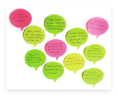
40 people took part in my user survey and I interviewed three potential users, who play similar games with apps (like Geocaching, Pokemon Go or Wizards United).
I created an affinity map of the answers to see the most pressing points and what the users value.
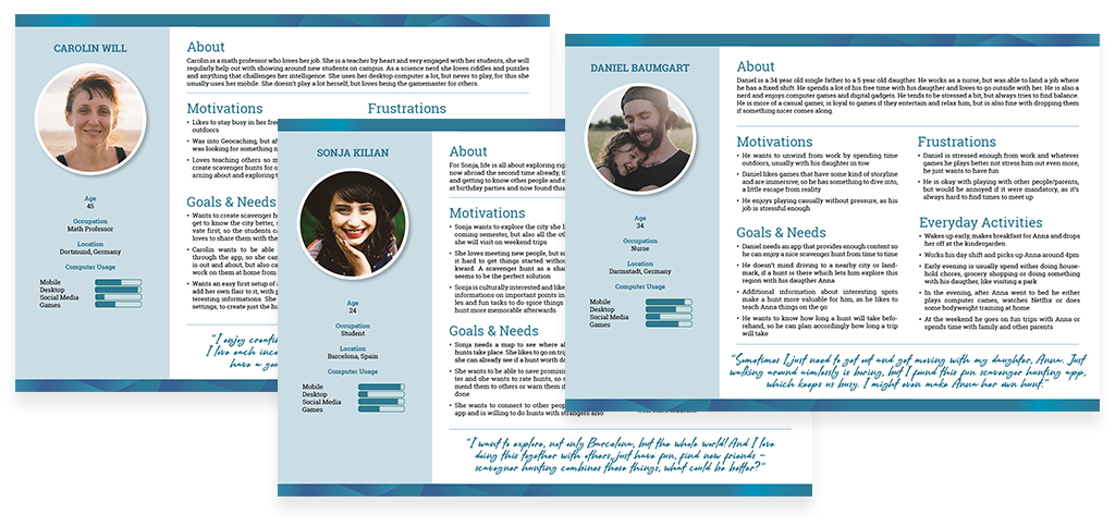
User Personas with Interesting Hobbies
The next step was to create user personas. This is to ensure that the users motivations and pain points are never forgotten or out of sight. It's a tool to keep the user the central key point of our design. I created three personas, based on the user interviews and the survey and referred back to them often throughout my design process.
Take a Journey with Me ...
The personas were used to create user journeymaps and user flows. This allowed me to imagine clearly the emotional ups and downs a user might have when navigating an app, to help me ensure that low points are caught and taken care of and high points kept up and inforced. All to make using this app a pleasant experience!
The user flows were the basis for the sitemap that would soon come to life and let me still walk in the user personas shoes for a bit.

Bringing order into it
Based on the userflows I had a good general idea what sites needed to be there. I went on to make a list of all the sites and sub-sites I expected to be there and scribbled several iterations of sloppy sitemaps on paper, before I went on to do the real thing.
To get an idea if the order I applied to the categories and sub categories made not only sense to me, but also to others, I conducted a card sorting test. A standardized grid of the results and a similarity matrix showed me that there was in general a lot of agreement with my way of sorting the pages in the app and so I could go on with only little adjustments.
This did not mean the sitemap was set in stone - just like layouts later, also this part of the app is in a never truly finished state and not set in stone.


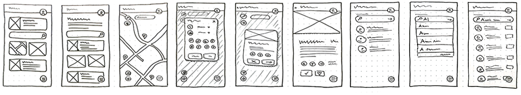
Picking up the pen and then XD
Next step was back to pen & paper: Wireframing! I had a lot of fun doing this and it is indeed a super important step in the process of building your product. Without much hassle it's easy to estimate what could go on a screen, how to sort things, how to group them. It's a big step, bringing ideas down on paper, from all the research and theoretical work that was done before.
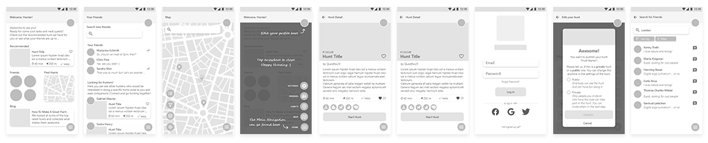
After a lot of drawing and trying, I went on to build mid-fidelity wireframes in Adobe XD and made these into a clickable prototype for the next step: Usertests!
Finally! Testing the Prototype
As much as I'd have loved to dive head first into the usability tests, the more sensible approach was chosen: Formulating a test script and a clear test plan. After all, I wanted to make sure that my users feel comfortable while being tested and that my questions allow for good feedback for my prototype.
The tests went smoothly and we had a lot of fun, it was super interesting to see what works and what doesn't - and also that I really have to work on my time estimation skills. Most tests took a lot longer than I anticipated, because my tests subjects were super eager and detailed. This meant I got a lot of valuable feedback, but in a professional setting a better time-management will be important.
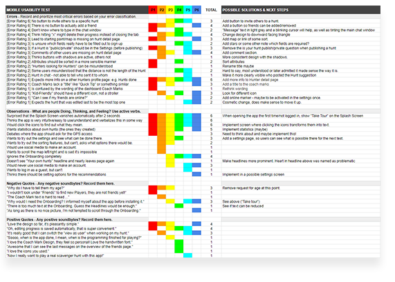
Digging through the results
The tests were recorded and so I was able to note down all that was said by the subjects, dividing it into categories and themes. Some feedback was about layout and information architecture problems, like issues finding the right pages or missing items. Other comments were about preferences, dislikes and likes while following the userflows.
There was so much that needed to be done! But the iterative process and working with mid-fidelity wireframes meant I didn't waste time by building a detailed, finished product before I looked for feedback and could now already make important changes, before I went deeper into the design of the app.
Color and Details
Now was the point where the app really came to life. The mid-fidelity wireframes turned into high fidelity, I added pictures and colors and real buttons and icons and animations. While this is clearly UI design and not usually part of a UX job, it was a very valuable lesson and I admit, I had a lot of fun doing it.
I used A/B-Tests or rather preference tests to see how users would decide on certain details of my design. For one thing I got very clear results (color choice) and for another (cover image) I got no clear preference from my users. It was only a small test, but fueled my curiosity in how bigger tests of this kind are performed and handled.
For the design I came up with a branding for the app, which started to come alive all throughout the design process already, but which now turned into clear and set rules about colors, fonts and sizes.
A final round of feedback from experts helped me work out issues with my design, which resulted in quite a few changes for the better.
What I learned
The whole process was very intense and I learned a lot. Most of all that, yes, people are different, every user has different pain points and opinions, but it is possible to find solutions that make many happy and it's always possible to improve. I am a big fan of the iterative process, which helps to find problems before too much work was put into a product. This way it's possible to focus on the important parts and not design something that is bound to fail, as you only later find out users might not like what you made.
I learned a lot and can not wait for more projects to come that teach me even more!
.